Rappel
 Lors du précédent article, nous avons réabordé le sujet du Chaos et de sa représentation. Le résultat de la première étude montrait la juxtaposition de deux zones clairement distinctes (structure du tableau = composition structurelle), de par leur coloration (chaude et froide) et leur structure interne liée à leur texture respectives, l'une très définie par des verticales et des horizontales, l'autre par un traitement plus organique, directement inspirée par les formes générales d'un arbre.
Le motif qui inspirait cette image était d'ailleurs un massif de bouleaux devant un grand immeuble locatif.
Et maintenant
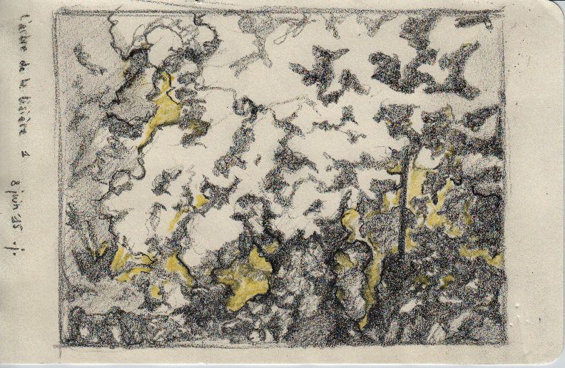
Pour l'étude d'aujourd'hui, le but est d'arriver à représenter une structure purement chaotique. Le résultat propose une image assez organique. La grosse difficulté pour représenter un tel sujet est justement l'absence d'une structure, de repères reconnaissables. Pourtant, ici également je me suis inspiré d'un motif réel, naturel. Afin de le rendre peu identifiable, j'ai utilisé d'autres couleurs que celles du sujet.Je présente le résultat final d'abord. Les études préalables viennent ensuite. De cette façon, chacun aura le loisir d'essayer de deviner ce que peut bien être la source première du tableau.
NB : cette peinture a tempera sur papier (30x40cm) sera marouflée ultérieurement sur un support rigide. Des taches de feuilles d'or y seront alors ajoutées afin de le parachever. Les emplacements des dorures sont déterminées par les éclats d'une sous-couche altérée, dont les traces en creux demeurent apparentes à travers les couches supérieures. C'est donc bien un déterminisme chaotique qui propose les endroits dorés, ce qui ajoute encore au vrai thème de cette peinture : le chaos.
 |
| Invitation 03, étape finale (avant dorure) |
 |
| Invitation 03, étape 3 |
 |
| Invitation 03, étape 2 |
 |
| Invitation 03, étape 1 |
English Résumé
Recall
In the previous article we readdressed the subject of Chaos and its representation. The result of the first study showing the juxtaposition of two zones clearly distinct (= structural composition of the table structure), by their color (hot and cold) and internal structure related to their respective texture, one of them very defined by verticals and horizontals and the other by a more organic treatment, directly inspired by the general shape of a tree. The reason that inspired this image was also a clump of birches in front of a large apartment building.And now
For today’ study, the goal is to represent a purely chaotic structure. The result offers a fairly organic image. The big difficulty to represent such a subject is precisely the absence of structure and recognizable landmarks. Yet here again I was inspired by a real, natural topic. To make it less identifiable, I used other colors than those of the subject.I am presenting the final results at first. Preliminary studies will come afterwards. This way, everyone will have the opportunity to guess what may well be the first source of the picture.
NB : this painting in tempera on paper (30x40cm) will later be laid on a rigid support. Gold leaf spots will then be added to finalization. The gilding locations are determined by the shrapnel from an altered undercoat whose hollow traces remain exposed through the upper layers. It is therefore a chaotic determinism which offers golden locations, which adds to the real theme of this painting : chaos.


